Welcome to the ultimate guide on choosing the perfect color scheme for your home decor! Whether you’re a first-time homeowner or looking to revamp your living space, selecting the right colors can make all the difference in creating an atmosphere that truly reflects your personal style. But with so many options available, it’s easy to feel overwhelmed and unsure of where to start. Don’t worry – we’ve got you covered! In this comprehensive blog post, we’ll explore everything from understanding the psychology of color to incorporating bold hues into your design. So grab a cup of tea, sit back, and get ready to transform your home into a haven of style and comfort. Let’s dive in!
Understanding the Psychology of Color
Understanding the Psychology of Color
Colors have a profound impact on our emotions and can greatly influence our moods and perceptions. Each hue carries its own unique psychological associations, making it crucial to choose colors carefully when designing your home.
Warm colors such as reds, yellows, and oranges tend to evoke feelings of energy, passion, and excitement. They create a sense of warmth and coziness in a space. These vibrant shades are perfect for areas where you want to stimulate conversation or encourage activity like the living room or kitchen.
On the other hand, cool colors like blues, greens, and purples promote calmness and relaxation. They are known for their soothing properties that can help create a tranquil atmosphere in spaces such as bedrooms or bathrooms.
It’s important to consider the function of each room when selecting color schemes. For example, if you’re decorating a home office where focus is key, incorporating shades of blue can enhance productivity while reducing stress levels.
When choosing between complementary or monochromatic color schemes for your home decor, think about what kind of visual impact you want to achieve. Complementary schemes involve using opposite hues on the color wheel (like blue and orange), creating contrast and vibrancy in your design. Monochromatic schemes stick to variations within one shade family (such as different tones of blue), resulting in an elegant look with subtle variation.
Bold colors inject personality into any space but should be used strategically so they don’t overwhelm the overall aesthetic. Consider incorporating bold hues through accent pieces like throw pillows or artwork rather than painting entire walls neon pink!
Neutral tones play an essential role in tying everything together harmoniously within your home decor scheme. Colors like beige, gray, or cream provide balance by acting as a backdrop for bolder elements while creating an inviting ambiance throughout your space.
Lighting plays a crucial role in how colors appear within a room – natural light will bring out true hues whereas artificial lighting may alter their appearance. Consider the positioning of windows and light fixtures when selecting your color
How to Determine Your Personal Style
When it comes to choosing the right color scheme for your home decor, one of the most important factors to consider is your personal style. Your personal style reflects who you are and what you love, so it’s crucial to choose colors that resonate with you.
To determine your personal style, start by looking at your wardrobe. What colors do you find yourself gravitating towards? Do you prefer bold and vibrant hues or more muted tones? Take note of the colors that make you feel confident and happy.
Next, consider the overall aesthetic you want to achieve in your home. Are you drawn to sleek and modern designs or do rustic and cozy spaces speak to you? Understanding your preferred design style will help guide your color choices.
Think about how different colors make you feel. For example, if a serene and calming atmosphere is what you’re after, cool blues and greens may be perfect for creating a tranquil space. On the other hand, if energy and vibrancy are what inspire you, warm yellows or oranges may be more fitting.
Another way to determine your personal style is by considering any specific themes or inspirations that resonate with you. Whether it’s nature-inspired elements or vintage charm, incorporating these influences into your color scheme can create a cohesive look that truly reflects who are as an individual.
Remember, there are no set rules when it comes to determining your personal style. It’s all about finding what speaks to YOU and makes YOUR heart sing! So take some time exploring different options before settling on the perfect color scheme for each room in your home.
Choosing a Color Scheme Based on Room Function
When it comes to choosing a color scheme for your home decor, one important factor to consider is the function of each room. Different rooms have different purposes and vibes, which should be reflected in their color palette.
For example, in the bedroom where you want to create a calm and peaceful atmosphere, soft and soothing colors like pastels or neutrals are ideal. These hues promote relaxation and help you unwind after a long day.
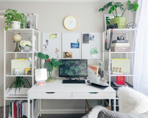
On the other hand, if you’re designing a home office or study area, you might opt for more energizing colors like blues or greens. These shades can boost productivity and focus while adding a touch of freshness to the space.
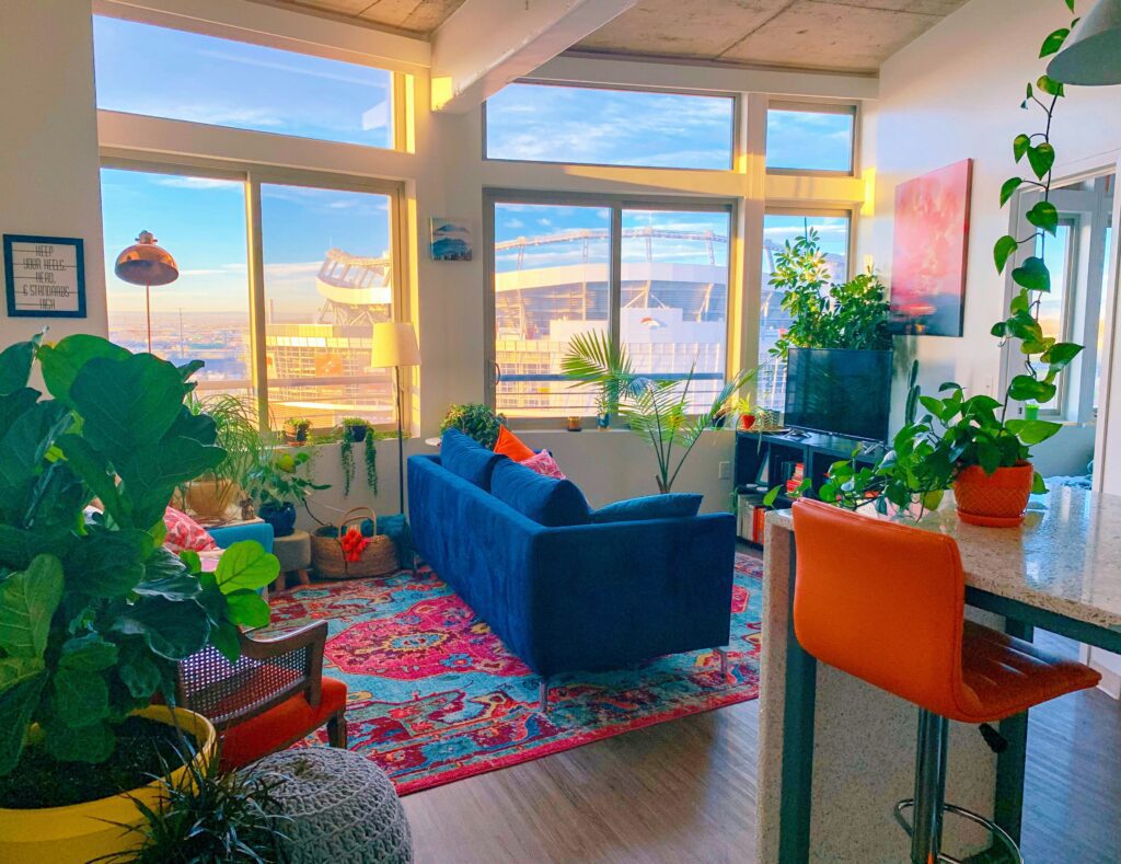
In spaces meant for socializing such as living rooms or dining areas, warm tones like reds or oranges can create an inviting ambiance. These vibrant colors stimulate conversation and make guests feel welcome.
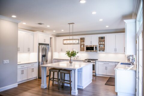
For kitchens where creativity often takes place, incorporating bold accent colors can add personality and excitement. Think about using pops of yellow or turquoise to bring energy into this functional yet lively space.
Bathrooms are typically associated with cleanliness and tranquility. Light blues or cool grays evoke feelings of serenity while also giving off a clean aesthetic.
Remember that there’s no hard rule when it comes to choosing colors based on room function – it ultimately depends on your personal preferences and how you want each space to feel. So go ahead, experiment with different palettes until you find what resonates with you!
Warm vs Cool Colors: Which is Right for You?
When it comes to choosing the right color scheme for your home decor, one important decision you’ll need to make is whether to go with warm or cool colors. Both have their own unique characteristics and can create different moods within a space.
Warm colors such as reds, oranges, and yellows are often associated with energy and comfort. They can make a room feel cozy and inviting, perfect for spaces like living rooms or bedrooms where you want to relax. These colors also tend to stimulate appetite, so they work well in dining areas too.
On the other hand, cool colors like blues, greens, and purples have a calming effect on a space. They can make a room feel more peaceful and serene – ideal for bathrooms or home offices where you want to promote focus and productivity. Cool colors also tend to visually expand a space, making them great choices for smaller rooms.
The decision between warm and cool colors should be based on your personal preferences and how you want each room in your home to feel. Consider factors such as the function of the space, natural light availability, furniture style/colors already present in the room when making your choice.
Remember that there are no hard rules when it comes to color selection; it’s all about creating an environment that reflects your personality while promoting harmony throughout your home.
Complementary vs Monochromatic Schemes
When it comes to choosing the right color scheme for your home decor, one important decision to make is whether to go with a complementary or monochromatic scheme. Both options have their own unique advantages and can create different moods in your space.
A complementary color scheme involves using colors that are opposite each other on the color wheel. This creates a high-contrast look that adds excitement and vibrancy to any room. For example, pairing blue with orange or red with green can create a visually striking effect. Complementary schemes work well when you want to make a bold statement and add drama to your space.
On the other hand, a monochromatic color scheme involves using different shades, tints, and tones of a single color. This creates a more harmonious and cohesive look throughout your space. Monochromatic schemes are often associated with simplicity and elegance. They work well when you want to create a calming and soothing atmosphere in your home.
Deciding between complementary and monochromatic schemes will depend on your personal style preference as well as the mood you want to achieve in each room of your home. Experimenting with both options can help you find the perfect balance that suits your taste and enhances the overall aesthetic of your space!
Tips for Incorporating Bold Colors into Your Design
Tips for Incorporating Bold Colors into Your Design
When it comes to home decor, adding bold colors can bring a sense of vibrancy and personality to your space. However, incorporating bold colors can sometimes feel intimidating. Here are some tips on how to do it successfully.
Start small: If you’re hesitant about using bold colors, start by incorporating them in small doses. Consider adding colorful accent pieces such as throw pillows, artwork, or rugs. This allows you to experiment with different hues without overwhelming the entire room.
Create focal points: To make a statement with bold colors, use them strategically as focal points in your design. For example, paint an accent wall in a vibrant shade or choose a standout piece of furniture that adds a pop of color to the room.
Balance with neutrals: When working with bold colors, it’s important to balance them out with neutral tones. This helps create harmony and prevents the space from feeling too overwhelming. Consider using neutral shades for larger furniture pieces or walls while reserving bolder hues for smaller accents.
Play with patterns: Another way to incorporate bold colors is through patterned elements such as curtains or wallpaper. Opt for patterns that include both neutrals and vibrant shades to add visual interest while maintaining balance within the overall design scheme.
Consider complementary shades: Bold colors don’t have to clash; they can actually work together harmoniously when chosen carefully. Look for complementary shades on the color wheel – these are hues that are opposite each other and create a visually striking effect when paired together.
Experiment with accessories: Accessories provide an opportunity to showcase your personal style and experiment with bolder tones without making permanent changes. Think about incorporating colorful vases, lamps, or even statement-making textiles like curtains or beddings into your design scheme.
Remember lighting considerations: Lighting plays a crucial role in how color appears within a space. Take note of natural light sources throughout the day and consider how they may affect the perception of bold colors. Additionally, experiment with different types of lighting fixtures and bulbs
How to Use Neutrals to Tie Everything Together
When it comes to home decor, neutrals can be a powerful tool in creating a cohesive and harmonious look throughout your space. Neutrals include shades of white, beige, gray, and even soft pastels. They are versatile and timeless, making them the perfect choice for tying everything together.
One way to use neutrals effectively is by using them as a base color for your walls or larger pieces of furniture. This provides a neutral backdrop that allows other elements in the room to shine. For example, if you have a bold statement piece like a vibrant blue sofa, pairing it with neutral walls and accessories will help balance the overall look.
Another way to incorporate neutrals is by layering different shades and textures. Mixing different tones of beige or gray can add depth and interest to your design scheme. You can achieve this by incorporating neutral throw pillows, rugs, curtains, or artwork into your space.
In addition to using neutrals as a base color or layering different shades together, you can also play with contrasting textures. Combining smooth surfaces with rough ones creates visual interest while still maintaining that cohesive feel.
Lastly,
natural materials like wood or stone can enhance the warm and inviting nature of neutrals.
Using natural materials as accents in your space will not only add visual appeal but also bring an organic element into your design scheme.
Neutrals are far from boring; they provide endless possibilities for creating beautiful spaces that feel calm yet sophisticated. So don’t underestimate their power! Embrace their versatility and let them tie everything together in harmony
The Importance of Lighting in Color Choice
When it comes to choosing the right color scheme for your home decor, lighting plays a crucial role in how those colors are perceived. Lighting can dramatically affect the way colors appear, making them look brighter or duller depending on the intensity and type of light used.
Natural daylight is considered the most accurate representation of color. It brings out true tones and allows you to see colors as they really are. When selecting paint or fabrics, it’s important to consider how they will look under natural light.
On the other hand, artificial lighting can alter the appearance of colors significantly. Different types of bulbs emit different hues – warm white bulbs tend to enhance warm tones like reds and yellows, while cool white bulbs bring out cooler blues and greens.
The placement of lights within a room also affects color perception. Shadows cast by overhead lighting can make rooms feel smaller or cozier, while strategically placed lamps can accentuate certain areas or objects.
To truly understand how different lighting conditions impact your chosen color scheme, it’s advisable to test paint samples or fabric swatches under various lighting scenarios throughout the day.
In conclusion (without using “in conclusion”), taking into account both natural and artificial light sources when choosing your color scheme is essential in ensuring that you achieve the desired ambiance in each room. By considering how colors interact with different types of lighting and experimenting with various options, you can create a harmonious space that reflects your personal style and meets your functional needs
Staying Consistent Throughout Your Home
Staying Consistent Throughout Your Home
When it comes to choosing the right color scheme for your home decor, one important aspect that often gets overlooked is consistency. Creating a cohesive look throughout your space can make all the difference in achieving a harmonious and visually appealing design.
Consistency doesn’t mean that every room needs to be painted in the same color or have identical furniture. Instead, it’s about finding elements that tie everything together and create a sense of unity.
One way to achieve consistency is by using a common thread throughout your home, such as repeating certain colors or patterns. This could be as simple as incorporating similar accent colors in different rooms or using the same type of flooring throughout your space.
Another key factor in maintaining consistency is considering the flow between rooms. As you move from one area to another, think about how each space relates to the next. Are there any jarring transitions? By selecting colors that complement each other and flow seamlessly from one room to another, you can create a sense of continuity.
Additionally, consider the overall style and theme of your home when choosing colors. If you have an eclectic mix of furniture and decor pieces, opt for a more neutral color palette that allows these items to shine. On the other hand, if you prefer a more cohesive look with matching furniture sets, choose complementary colors that enhance each piece.
Remember to pay attention not only to walls but also ceilings, trimmings, and even doors when establishing consistency within your home decor scheme. These elements shouldn’t clash but rather work together harmoniously.
In conclusion (without saying “In conclusion”), selecting the right color scheme for your home decor requires careful consideration of various factors including psychology of color principles , personal style preferences , room function requirements , warm vs cool tones effects , complementary vs monochromatic schemes benefits boldness use techniques neutrals importance lighting impact & staying consistent concepts . Understanding these aspects will empower you to create a space that reflects your personality, suits your lifestyle, and brings joy every